Pepe's Crepas & Baguettes
Context
Pepe's began as a small family business between a father and son. They quickly became well known for their food and service — but as the business grew, they started thinking bigger.
Problem
The existing brand no longer reflected what they were doing. A generic chef illustration, misaligned colors, and a palette that said nothing about the food. They needed an identity that could grow with them.
Solution aiming big
I designed a brand with an illustration approach to highlight the two primary products: the crepe and the baguette. The color palette communicates freshness and natural ingredients, accompanied by a customized retro script. The goal was to build something that could scale — a brand ready to become a bigger company.
Outcome consistent experience
The new identity connected across printed materials and the physical location, creating a consistent experience for the first time. The brand ran for three years under the same identity.
The challenge
Where we started
The client came with two hard constraints: keep the name, keep two specific colors — red and pistachio green. Everything else was open.
That clarity was actually a good starting point. We researched the competition to understand the landscape, because the ambition wasn't just to look better — it was to build something that could support multiple locations across the state.
It was also my first illustration project. That was a challenge I took seriously.
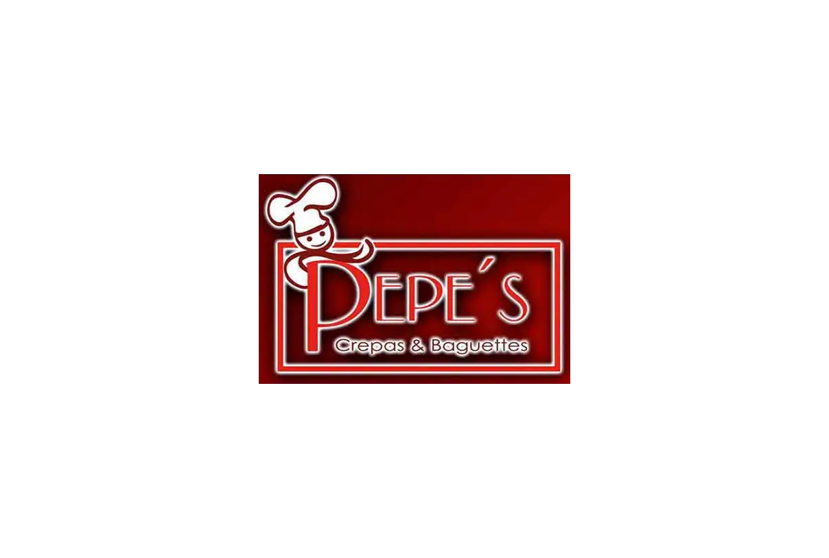 Old logo
The creation
Creative process
The illustration was designed from scratch to read immediately: a crepe and a baguette, simplified enough to scale but detailed enough to feel handcrafted. Vibrant gradients gave it presence without losing the warmth the food needed to communicate.
For the type, I started with a typeface and made targeted adjustments — tightening the kerning, vectorizing the letterforms, and adding curvature — to make it feel less off-the-shelf and more ownable.
Montserrat and Century Gothic rounded out the system for secondary applications.
The menu leaned on texture to add a sense of tradition, giving each plate room to communicate flavor on its own.
The constraints
Red and pistachio green as a mandatory palette sounds limiting. In practice it forced every decision to work harder — the illustration, the type, the layout all had to pull their weight within a tight system. That kind of constraint is where the interesting design happens.
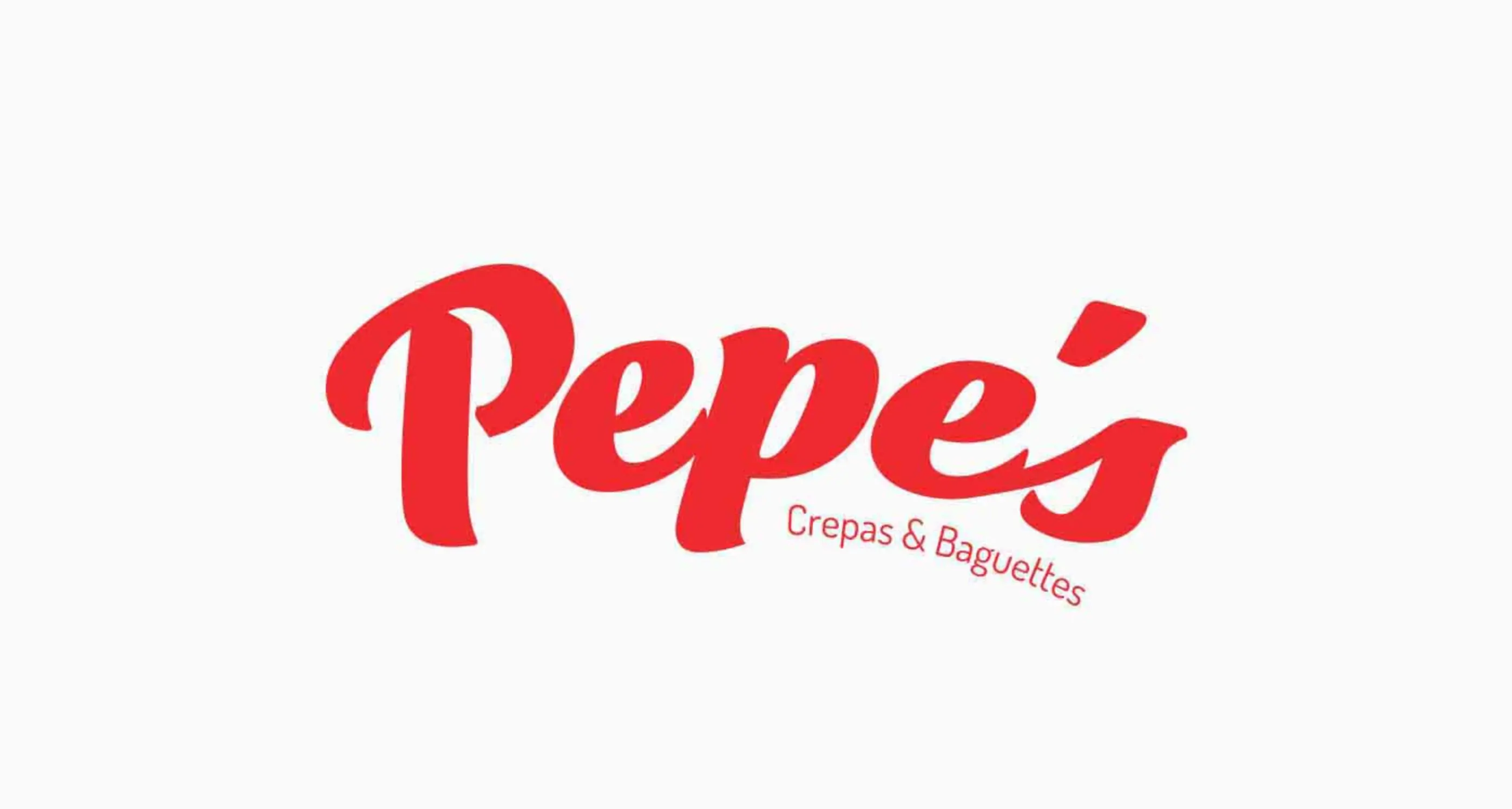 Logotype
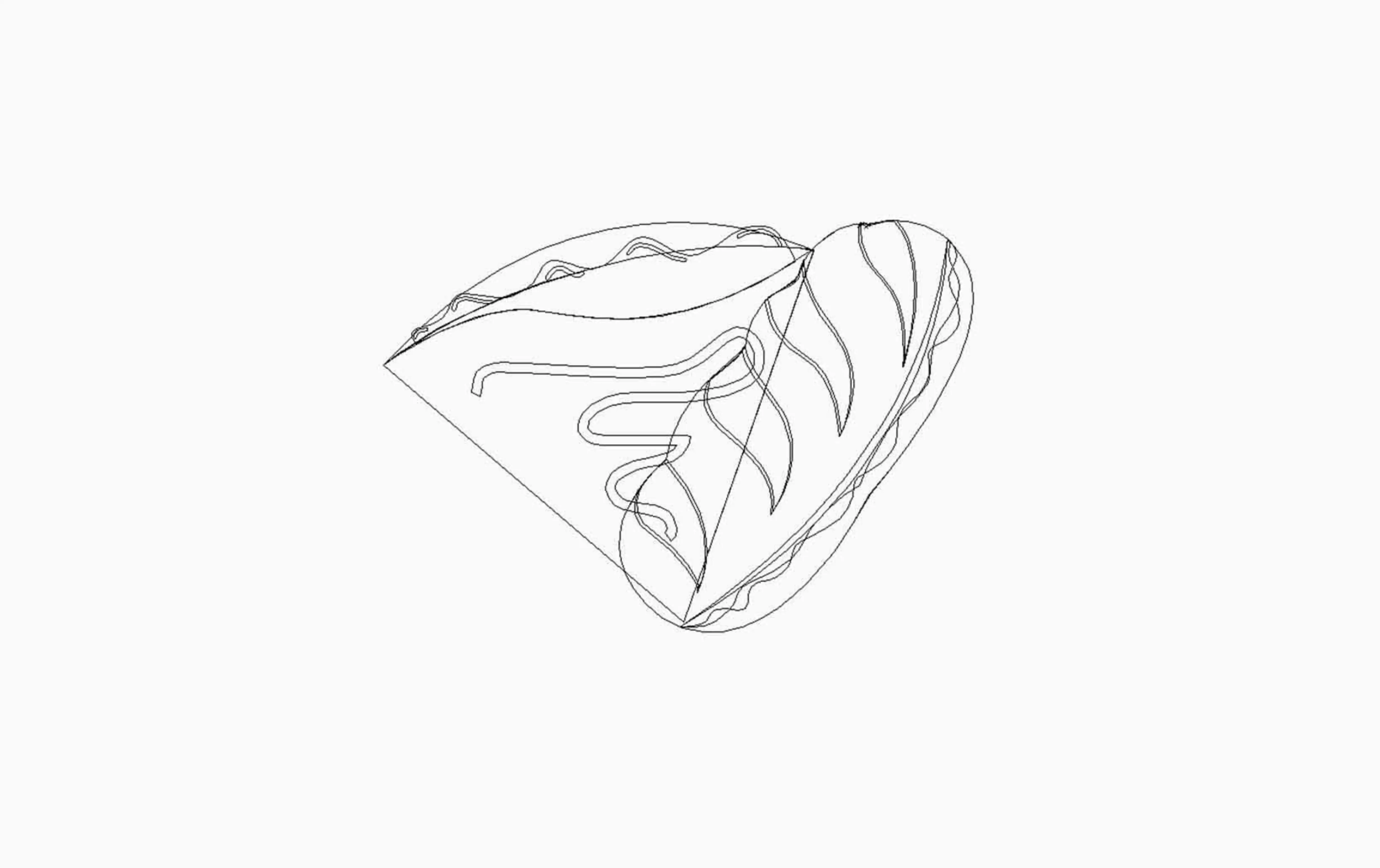 Vectorized illustration
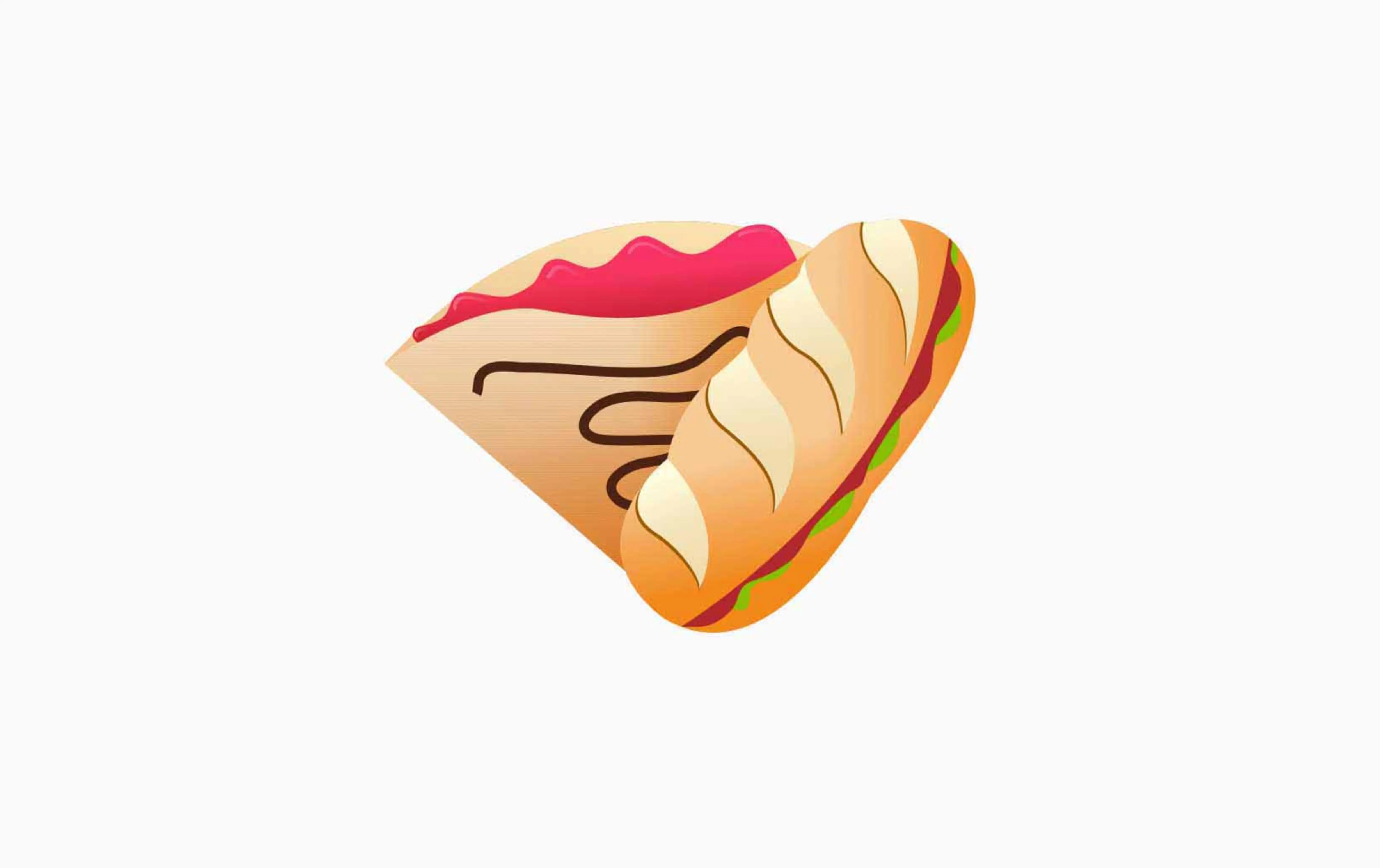 Full color illustration
The impact
Where we landed ~3 years, fully operational
The identity held across every touchpoint — signage, printed menu, physical location. For a first illustration project, it did exactly what it was supposed to: make a small family business look like it was ready to be something bigger.
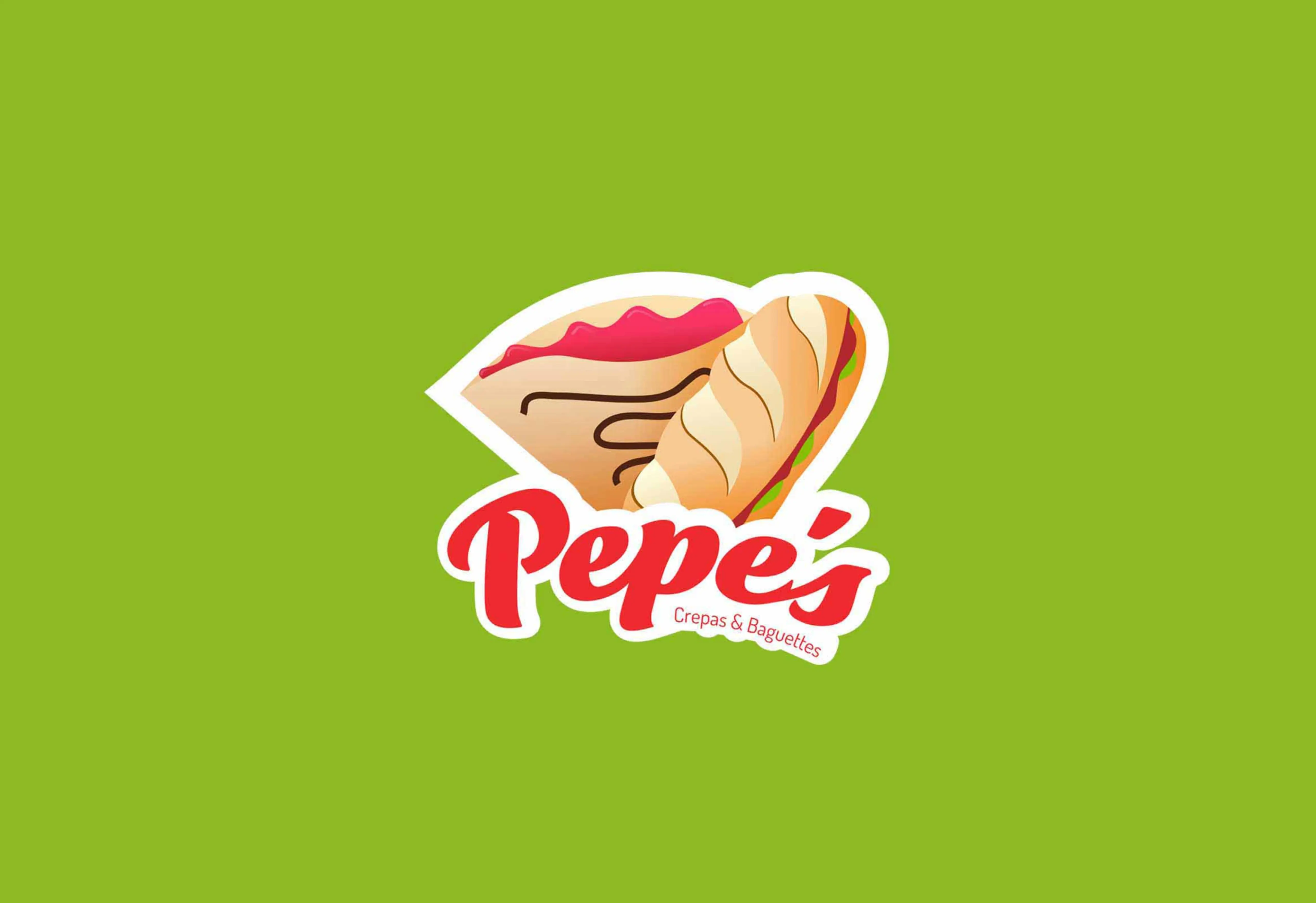 Imagotype
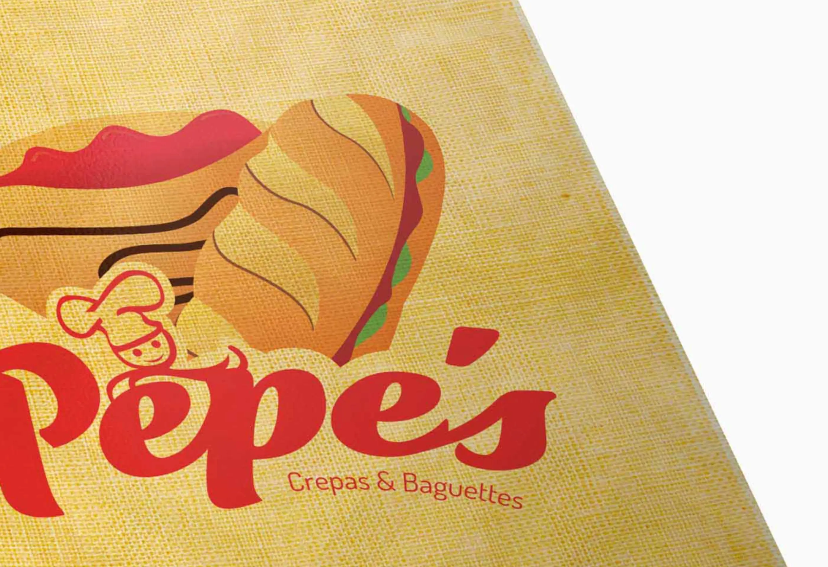 Menu cover
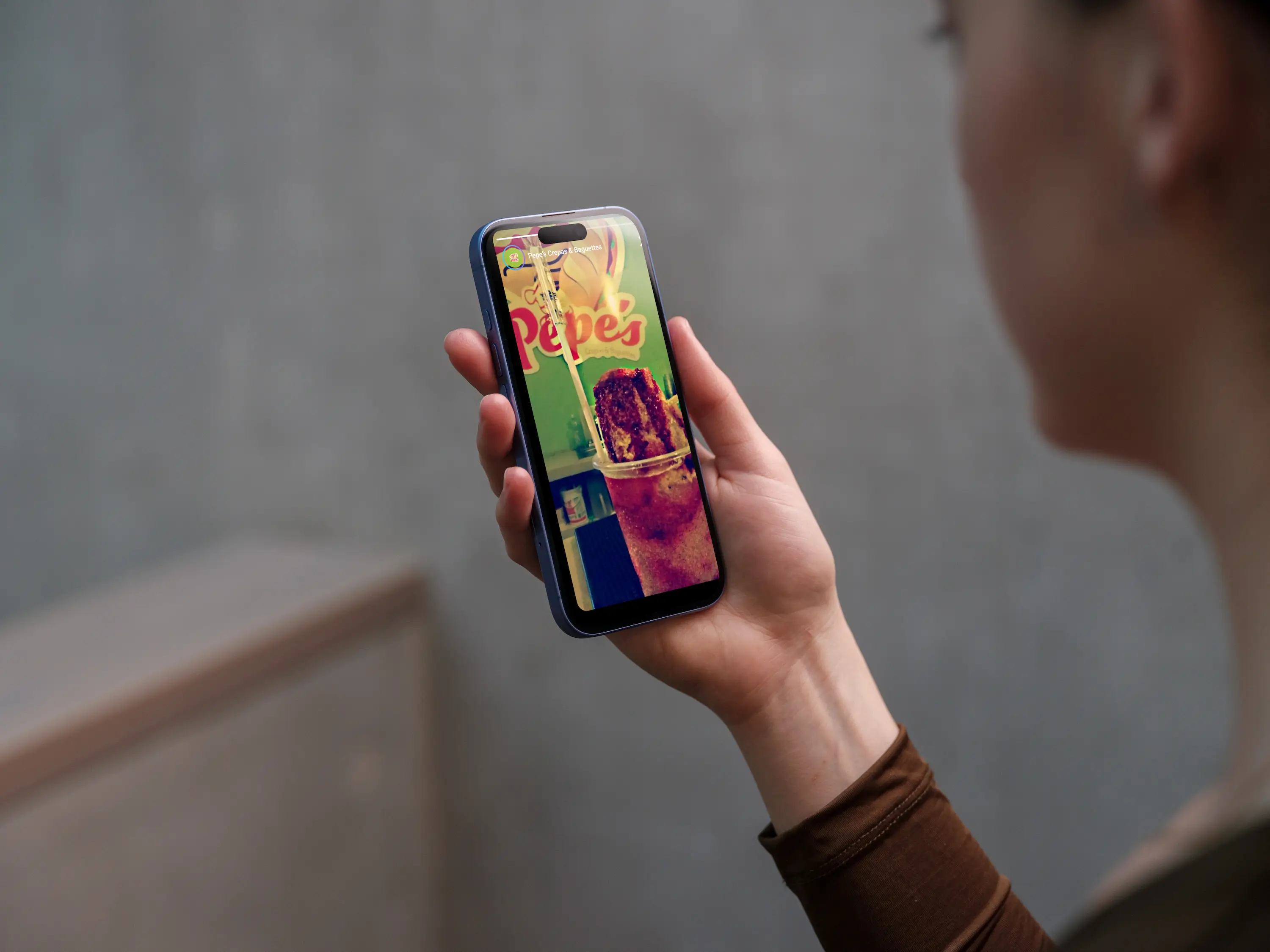 Social media
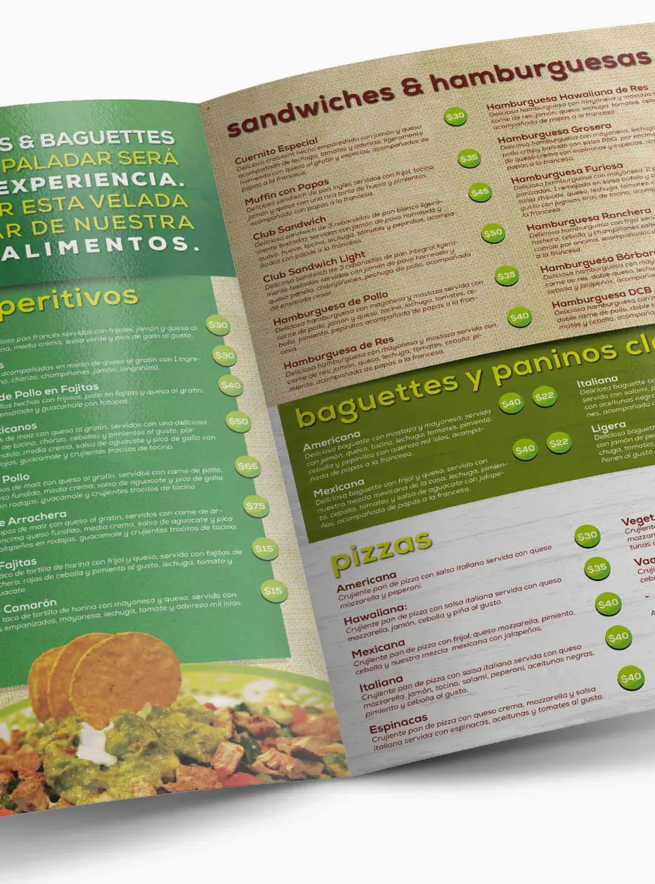 Menu
Menu