Dentavit
Context
The client wanted to open her first dental office. She was newly graduated — a disadvantage she was fully aware of — but she already had a specialization, and that was her edge.
Problem crowded market
Tekax is a city with well-established dentists and a below-average socioeconomic level. We needed to build a brand that could position her not as just another dentist, but as a specialized office focused on prevention, diagnosis, and treatment — aligned to her vision from day one.
Solution specialized from day one
I designed a brand that combines a tooth and a heart, with a name that reflects the importance of taking care of our dental health. A tagline about the smile completed the message — because a smile is the best impression someone can give.
Outcome
Dentavit opened in 2017. As of August 2026, the office has attended around 1,000 patients and the client has become one of the most recognized professionals in the city.
The challenge
Where we started
We started by understanding what the client wanted. She already had a vision and a mission that could guide the process — which isn't always the case, and it made a real difference.
We also researched the competition. Most of them didn't have a brand beyond their name. That was the opening.
A client with a vision
She came with a name in mind: Vesalius. It was a strong reference, and it showed she was thinking seriously about what she wanted to communicate. But it also raised a question: would that name connect with patients, or would it create distance? That conversation led us toward something more direct — a name that said exactly what the practice stood for.
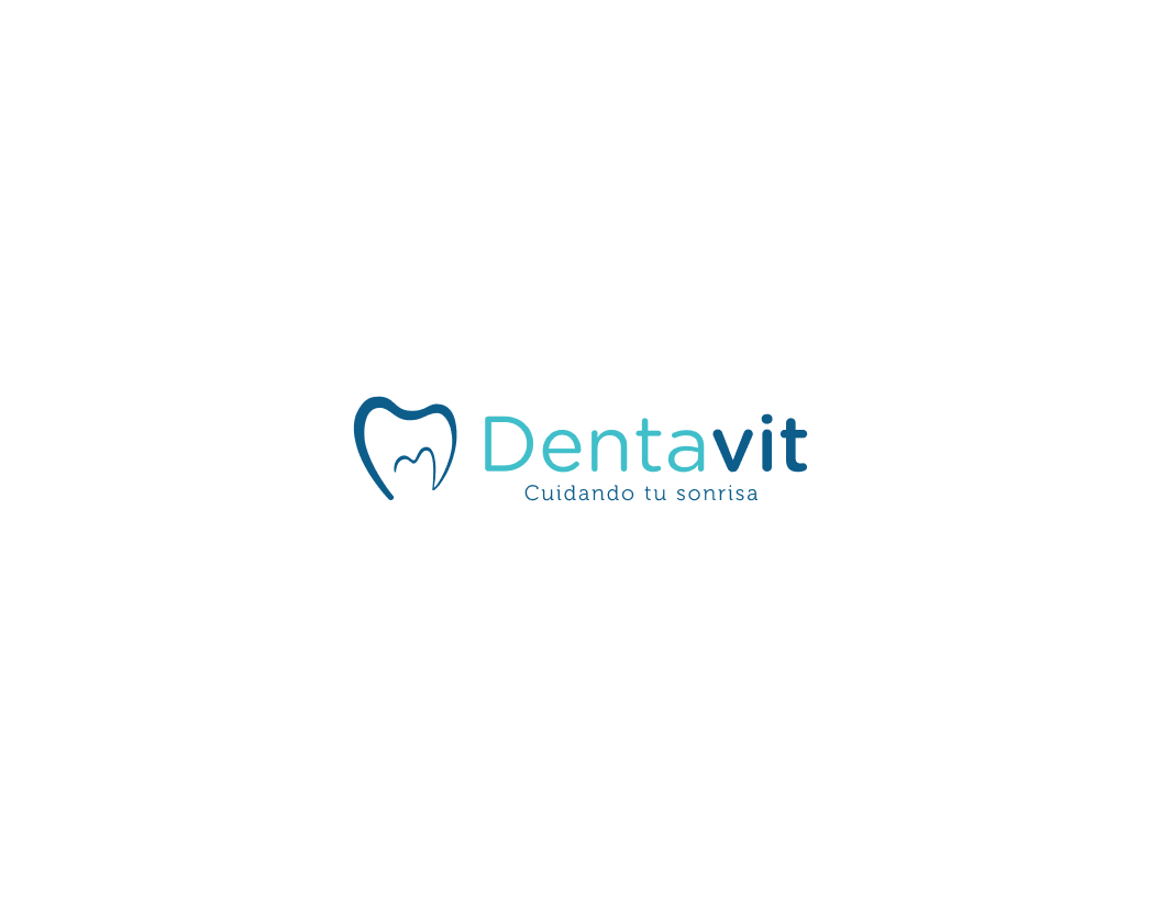 Logotype
The creation
Creative process
Dentavit comes from the words dental and vita — dental and life — together framing the importance of taking care of our oral health.
The symbol is a tooth silhouette that grows from a heart shape at its center, built to carry one message: caring for your teeth is caring for yourself. The tagline, "Cuidando tu sonrisa" — taking care of your smile — closes the loop, bringing it back to the most visible thing dental care protects.
For the type, we chose Gotham Rounded and Museo — clean, professional, and medical without feeling cold. The rounded details keep the brand approachable, which mattered for a practice built around patient trust.
The blue palette aligns with the medical segment. A gray complement keeps it grounded without pulling attention away from the brand.
 Isotype
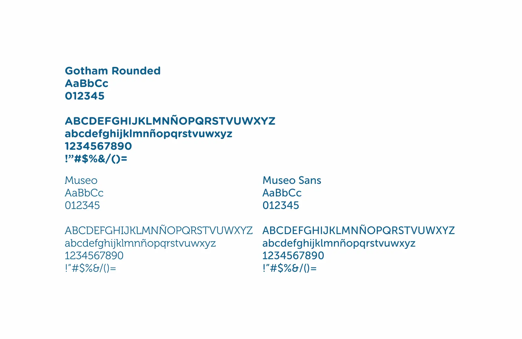 Typography
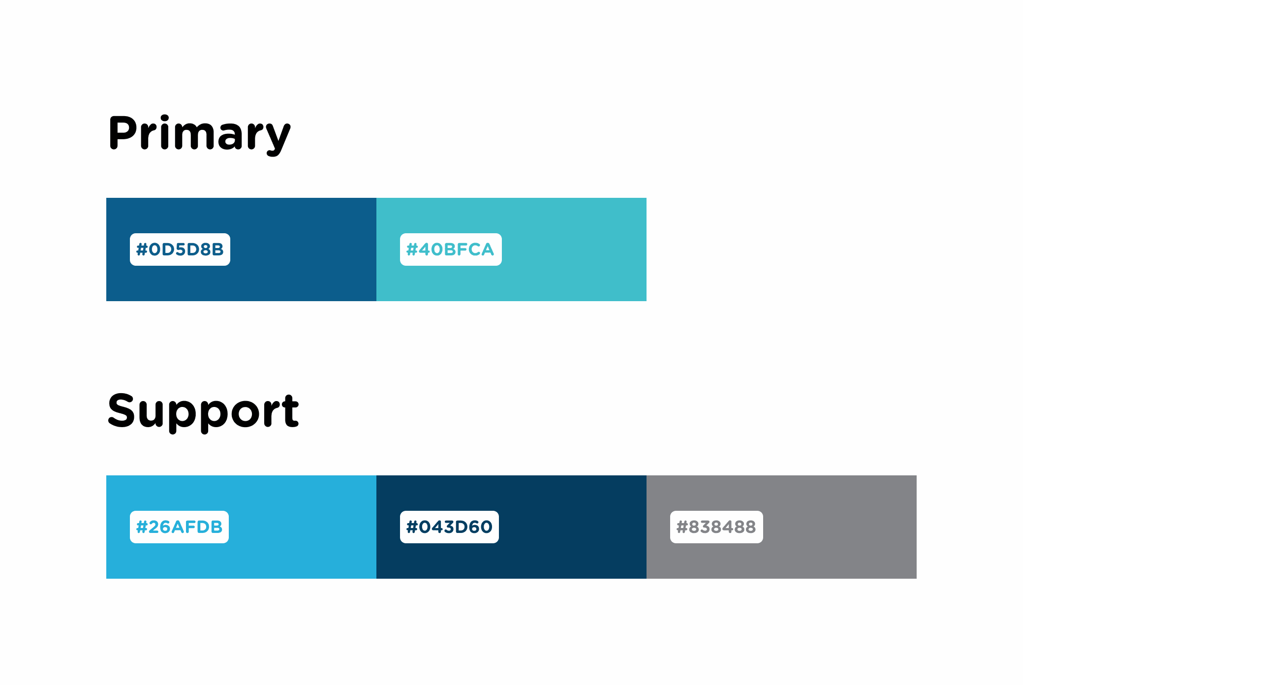 Color palette
The impact
Where we landed ~10 years, still growing
As of August 2026, Dentavit has attended around 1,000 patients — 30% of them recurrent. For a practice in a mid-sized city with established competition, that retention number is the real result.
The client went from newly graduated to one of the most recognized professionals in Tekax. The brand held through all of it.
The work continued
The identity extended into clinical materials — post-operative instructions, stationery, and patient-facing documents, keeping the brand consistent across every touchpoint inside and outside the office.
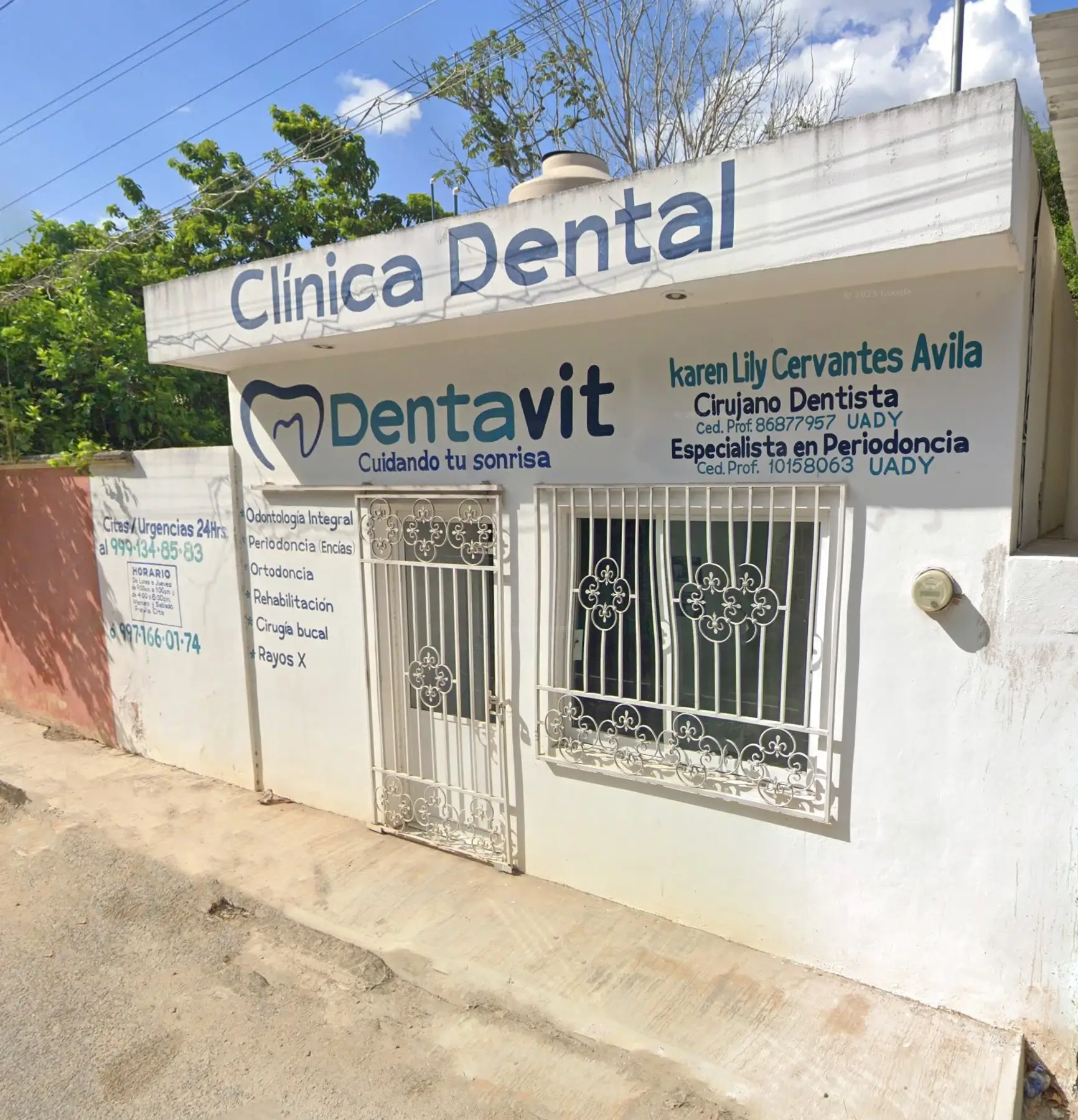 The office
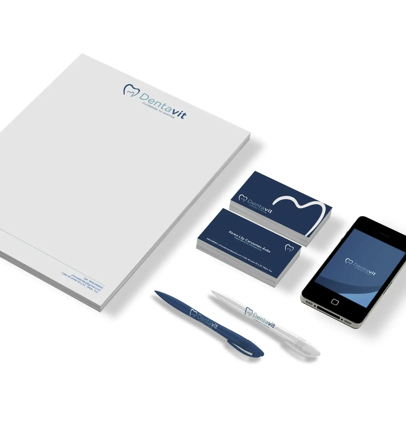 Stationery
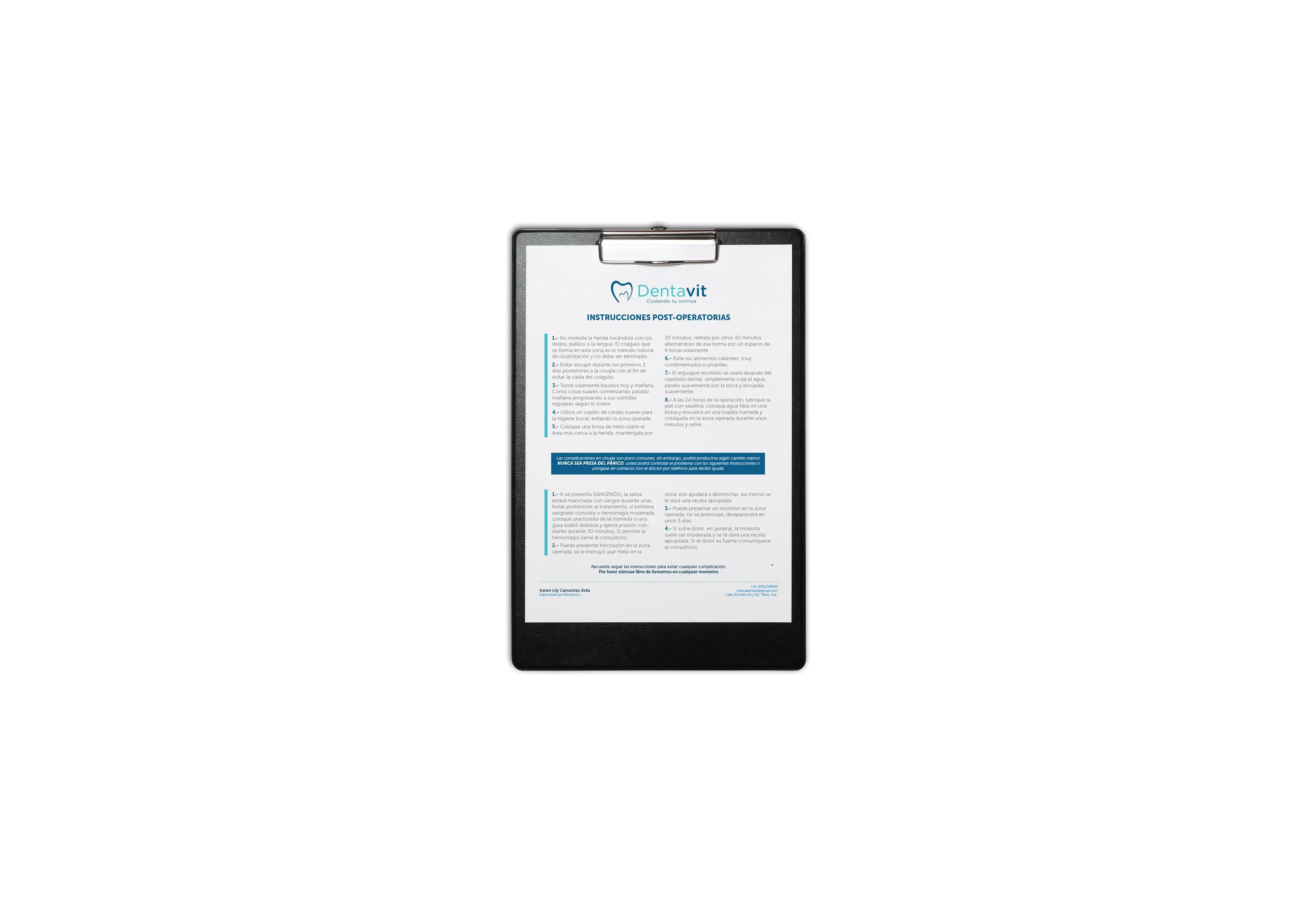 Post-op instructions